mastodon uno admin
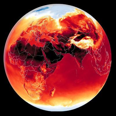
Do you know?
Interactive map with factories and their CO2 emissions.


Do you know?
Interactive map with factories and their CO2 emissions.
A terrific visualisation of our rising seas!! Also somewhat mesmerising in itself, as an art form, of a dreadful condition & future. And as you say, it “is only going to get harder to ignore.” 
#ClimateCollapse
#RisingSeas
#ClimateChange
#dataVisualisation
#Future
 Learn Data Science — Fast, Practical, Job-Ready!
 Kickstart yo...
Is there a way to graph trending hashtags on mastodon/the Fediverse?
What I'm interested in is to graph say my local city of #Adelaide and use that as a bit of an indicator of if #Mastodon usage and engagemement is growing locally in my town
And yes im interested in data across the fediverse or at least across a few selected servers, as I want data beyond just a single instance.
I can see this on my desktop web interface right now.. so Im guessing there *should* be a way.

[#veille] Portraits d'archivistes - #AAFRennes2025 : datavisualisations à partir de la liste des inscrit.e.s
https://patrimoine-et-numerique.fr/data-visualisations/89-portaits-darchivistes-aafrennes2025
#archives #archivistes #datalove #dataviz #datavisualisation #OpenRefine #Flourish #map
@archivistodon #archivistodons

")
Enhance your R data visualisation by using the {reactable} and {sparkline} packages. Learn how to include sparklines inside HTML tables in our latest blog post by our Data Scientist Osheen MacOscar.
#DataScience #RStats #DataVisualisation #Sparklines #Reactable
https://www.jumpingrivers.com/blog/sparkline-reactable/
")
We're recruiting a (Senior) Research Software Engineer! Join the KDL team and collaborate with partners to develop digital tools to explore academic research in new ways.
https://www.kcl.ac.uk/jobs/109427-senior-research-software-engineer
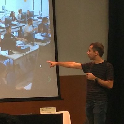
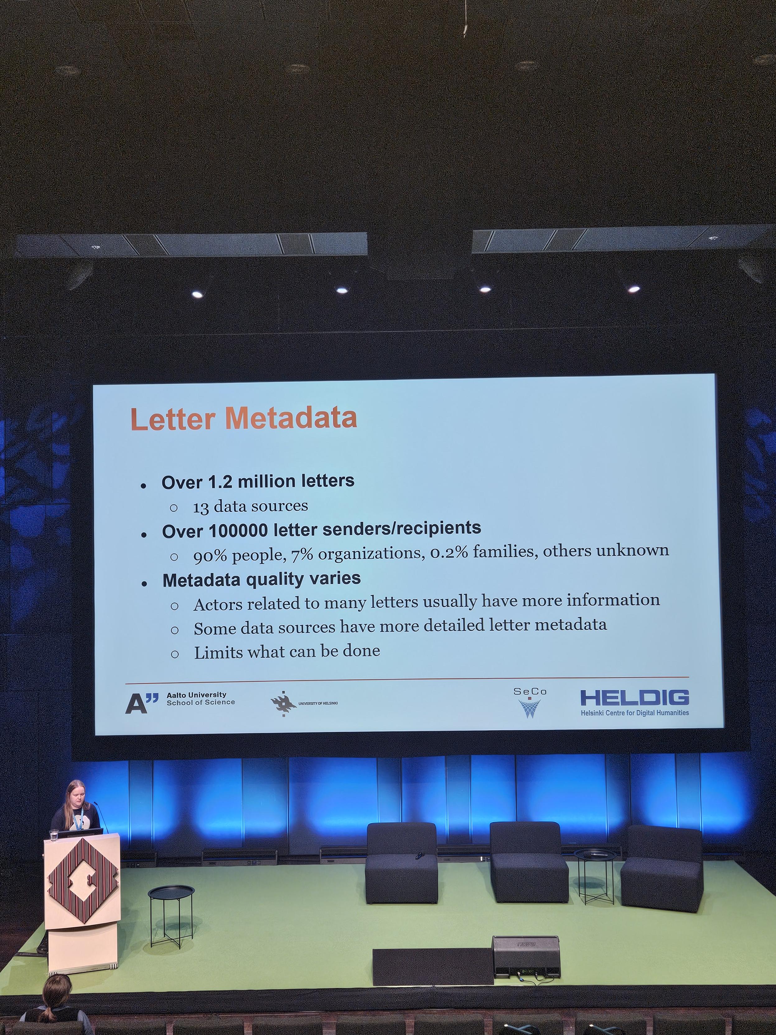
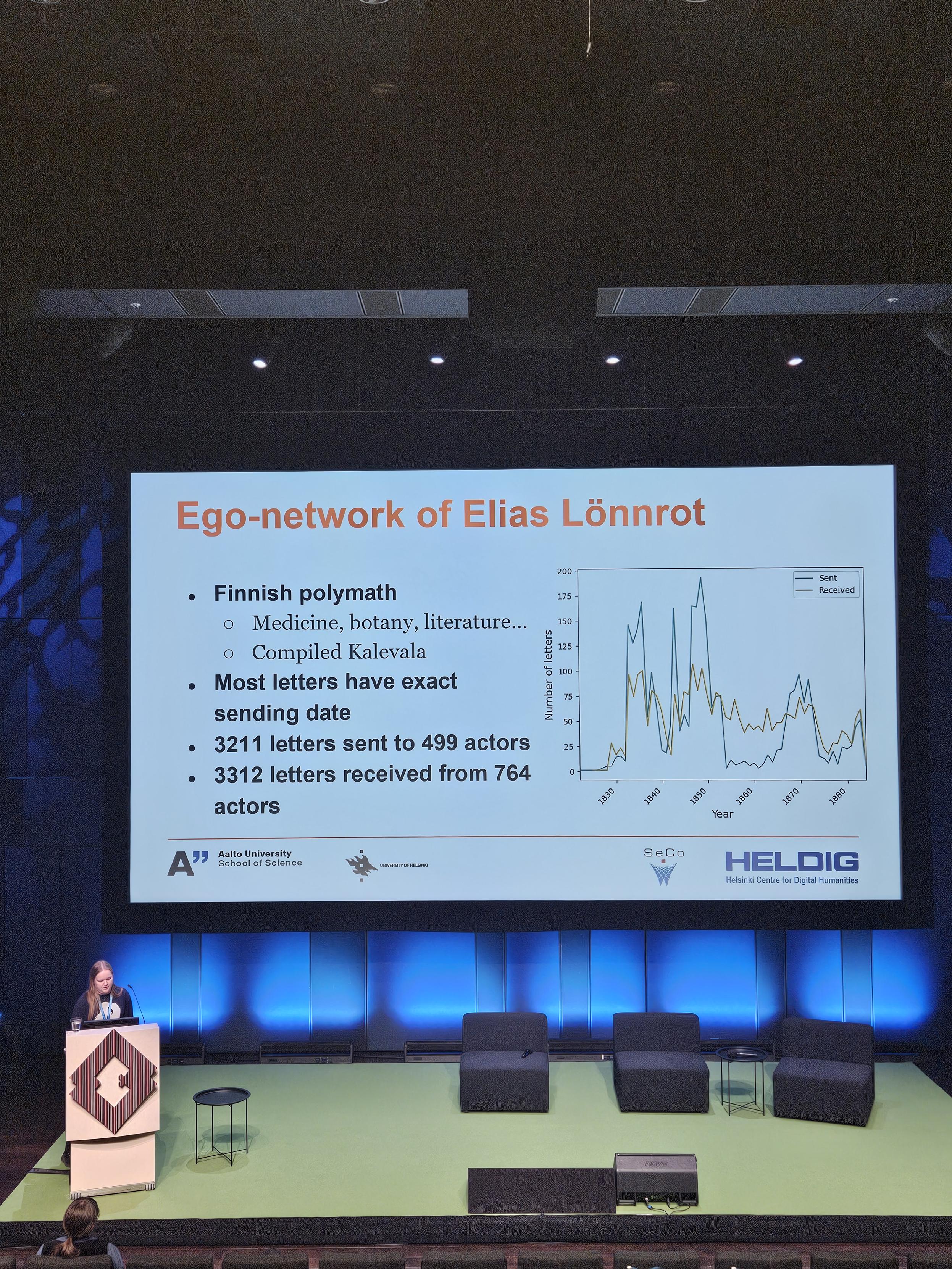
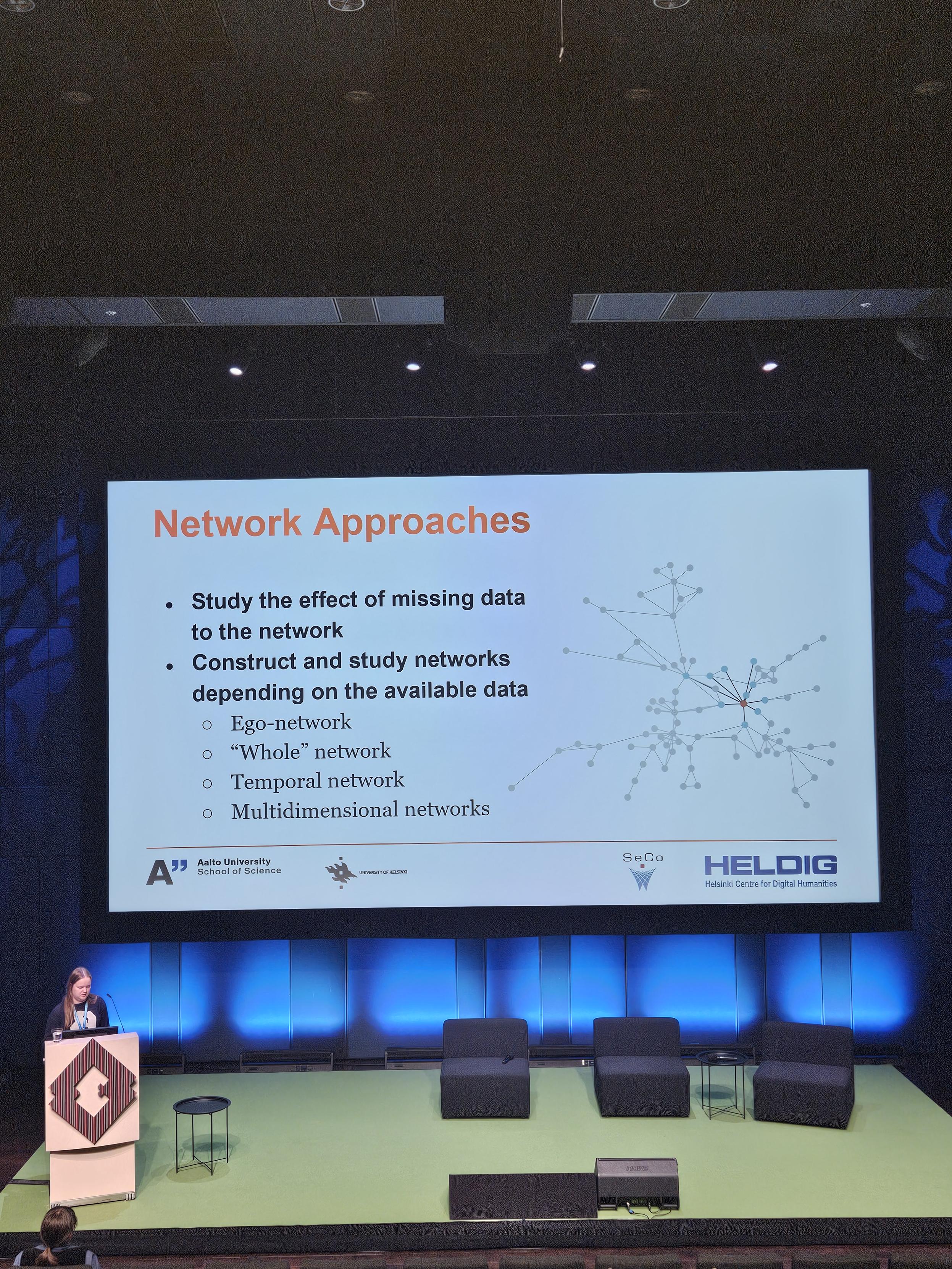
Using knowledge graphs for network correspondence analyses, a Finnish case study using their national Sampo-infrastructure as triple-store and SPARQL endpoint.

I'm saddened by the lack of reference to Prince's Purple Rain, but I do think Word Rains have potential when analysing corpora. Would be cool to have an interactive version integrated into a full-text search service!

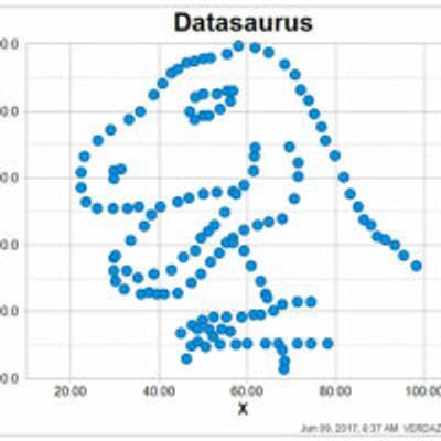
While I try to find time to write a PhD update blog post, here's a Cool Graph I plotted recently for my rainfall radar model.
One of the things I have been asked to do in my PhD corrections is to assess the model's stability. To this end, I trained a series of models at different learning rates, and this is the result.
Now I just need to figure out why the output prediction looks like it has a case of chickenpox.....
 results in higher and more stable validation accuracy than a higher learning rate (lr=0.01). Particularly higher learning rates are very variable in accuracy; stretching from 0.3 - 0.8. Lower learning rates are ~0.8 - ~0.95.")
 Le webinaire sur la datavisualisation, organisé par le GTSO #Données de Couperin, est désormais disponible en replay !
 Tenu le 17 décembre 2024, ce webinaire explore l’art de transformer des données complexes en récits visuels clairs, fonctionnels et esthétiques. Mais attention : une belle image ne suffit pas, elle doit aussi rendre les informations compréhensibles et pertinentes.
Ce webinaire propose :
 Des concepts et outils issus de différents univers disciplinaires.
Des exemples concrets de projets et solutions pratiques.
Une réflexion sur la place de l’image comme vecteur d’information.
 Intervenants :
Jean-Daniel Fekete (Inria Paris-Saclay)
Étienne Côme (Université Gustave Eiffel)
Découvrez le replay et les supports sur notre nouvelle chaîne CanalU :https://www.canal-u.tv/chaines/couperin/derriere-la-beaute-des-images-des-donnees
. 2024 is the first to surpass 1.5ºC diff.")


@OpenSciTwente @matplotlib @bret I can think of two options for #datavisualisation #dataviz
https://labplot.org/ is a desktop #FLOSS with a nice GUI to generate #dataviz that can also generate code and they are on the #fediverse @LabPlot .
#plotly has an online visual editor that is also quite interesting: https://chart-studio.plotly.com/create/#/
Our courses for the first half of 2025 have now been released. We have everything from the very basics of R and Python for data science, to advanced statistical modelling and machine learning.
#Programming #Python #Shiny #Quarto #DataVisualisation #Upskill #Training
Everyone knows ggplot2 in R or matplotlib in Python. But what are the differences between theese 2 programming languages and what are the most important R & Python libraries for visualization? 
For those interested in such things here is a map showing the change between ORR FY2018/19 and FY2023/24 aggregated passenger in orange overlaid on a the FY2023/24 numbers in white at the same scale, with the increase on the left and decrease on the right.


#scienceouverte #datavisualisation
[BLOG] Découvrez HAL monitor, un outil de visualisation pour explorer les données de HAL.
HAL monitor propose une interface conviviale pour produire vos rapports statistiques.
Lire le billet  https://www.ccsd.cnrs.fr/2024/12/hal-monitor-un-outil-de-visualisation-pour-decouvrir-les-contenus-de-hal/
. Les visualisations choisies montrent : un graphique en courbe pour les dates de publication des documents déposés, un diagramme circulaire présentant le taux de présence de DOI (65%), un diagramme circulaire présentant le taux de présence de projet ANR (10%) et une carte présentant les pays des tutelles des co-auteurs.")